Logo design, identity system Unity School in New York City. After researching school crossing signs in Great Britain, the symbol of "light" or "lamp" of knowledge shines above the letter "I" in Unity. The letters "N" and "Y" are in black to place emphasis on the school's location in New York City. The new identity received recognition from the American Graphic Designers Association.

Identity & Integrated Branding Programs, Square D Corporation. The objective of visually communicating a "new way of learning" creates the basis for the "rebus" in this series of employee course catalogs. The project received recognition from Print's Design Annual.

Direct Mail, The School of the Art Institute of Chicago. Most people will probably enjoy the "coupon" which has strong associations with price and value. The exhibition was called "Cheap Art," and the final project received recognition from Print's Regional Design Annual.

Logo, Identity program for Burt's Bees. The proper utilization of the logo, with guidelines to internal and international markets was important to build global brand consistency for the Burt's Bees organization.

Identity systems, packaging and advertising for Iman Cosmetics. Brand identity, packaging and advertising programs for Iman. The products were leaders in using the latest technology for Iman Cosmetics. The tagline says it's "All you want, and All you need."
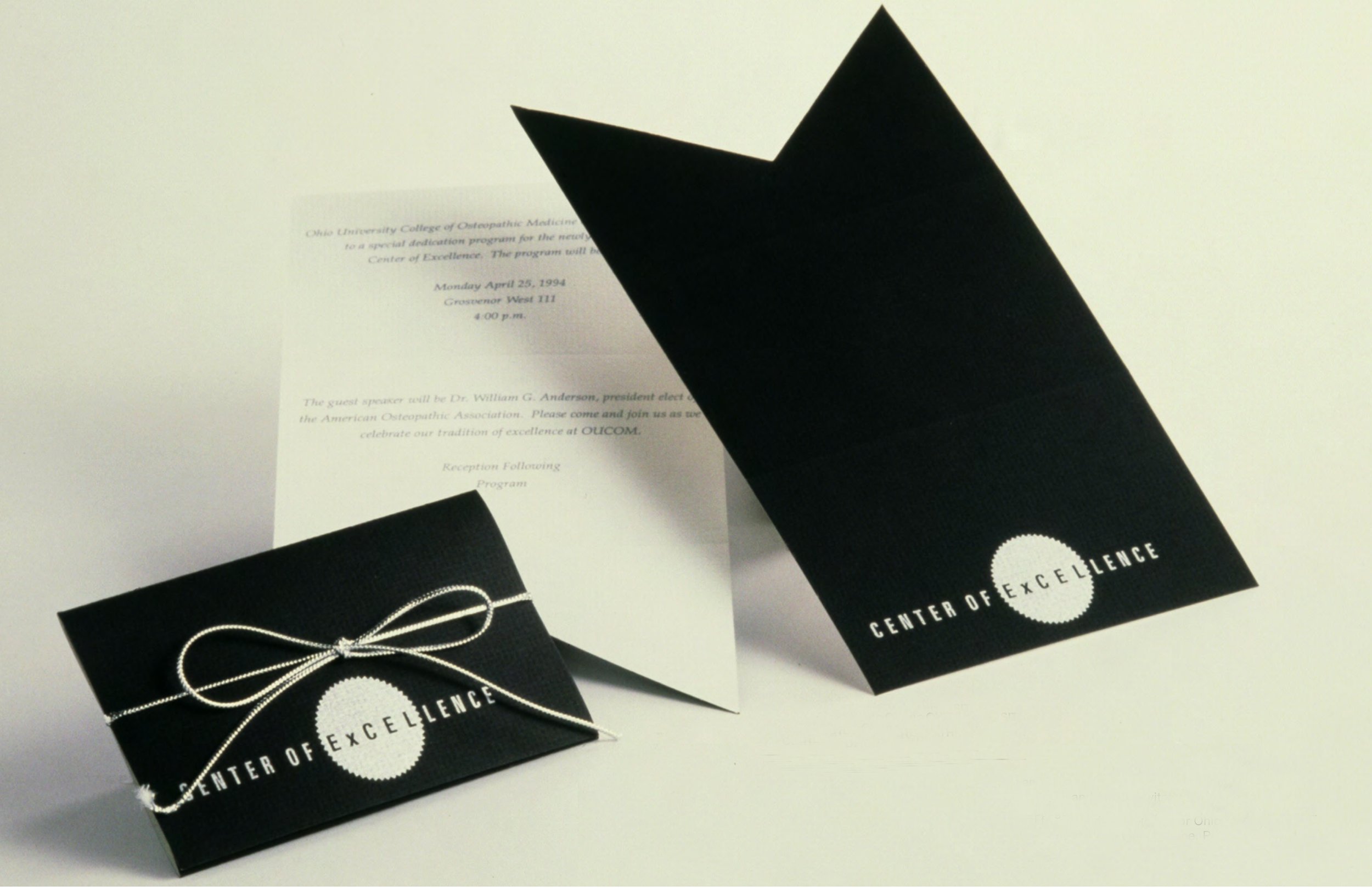
Logo, identity program for Ohio University College of Osteopathic Medicine. Program "Excel" was created because Ohio University College of Osteopathic Medicine was awarded "Center of Excellence" status. The new "excel" identity was applied to all university community touch-points, architecture, print, advertising and packaging, as well as the inaugural invitation displayed above.

Promotional brochure for Fisher Design: When a film is completed, it's known as being "in the can." That was the logic behind using a ticket, a brochure, (film strip format) film can, and collage. This was created to help clients in the film industry understand Fisher Design's capabilities. The promotional vehicle was awarded a gold medal from the Cincinnati Art Director's Club.

Brand Book Posters, 22" X 34" Burt's Bees Brand Book launch was accompanied by promotional posters written in English, French, Spanish, and Italian to help employees understand the importance of following the brand guidelines, color palette usage, photography, and typography on all of the organization's corporate communications.

Poster Design, School for Creative & Performing Arts Black Box Theater. The reflective metallic silver ink letters form the title, "Dark of the Moon," and also creates a "half moon" gestalt in this poster for the School for Creative & Performing Arts.
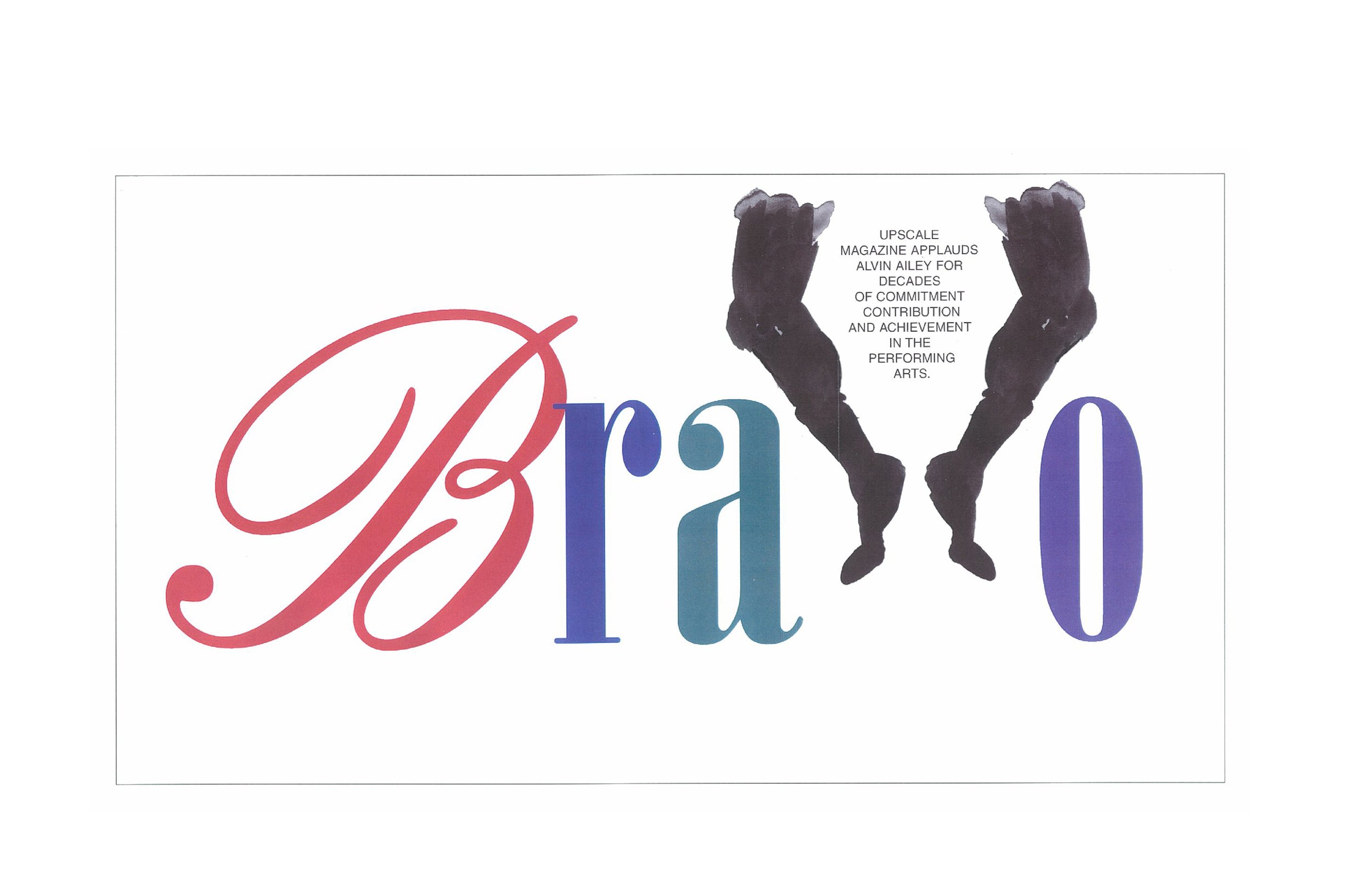
Design & Illustration, Upscale Magazine The assignment for Upscale Magazine combines typography with image. The ad honors the contributions of Alvin Ailey to contemporary modern dance and the performing arts.

Corporate identity and packaging, Patti LaBelle "Girlfriend." Identity and advertising for "Girlfriend" by Patti LaBelle was created for the vivacious, elegant, sophisticated, and versatile modern woman. The initial fragrance and body lotion product launch exceeded all marketing and sales expectations.

Logo, identity and packaging program, Gorant Chocolatier. "Gorant is a premium chocolate company, the new redesign, brand identity, and visual language, utilizes a clean modern contemporary aesthetic with "gold" accents to reinforce the "premium quality" of it's products.

Holiday Card Design, Ohio University College of Osteopathic Medicine Ohio University's colors just happen to be green and white. The center interlocking "O" is the logo for the Osteopathic School of Medicine, and the red and white "J" candy cane, was an added "found object" in this holiday card design.

Handbook, Ohio University College of Osteopathic Medicine The "holistic" approach to osteopathic medicine is the logic behind the die-cut heart, eye, and hands, that were used as the "holding device" for the handbook inside. The project for the Ohio University College of Osteopathic Medicine received recognition from juror and Pentagram designer Michael Beirut at the Columbus Society of Communicating Arts (CSCA).

Corporate identity and packaging, Ashanti Natural The natural "bone" bottle cap of Ashanti "Natural" fragrance is the first visual cue in it's packaging. The product is part of the Flori Roberts brand. After a successful debut, the Flori Roberts brand earned spots in Burdine's in Miami and Foley's in Houston.

Corporate identity & packaging programs, Campbell Soup Company Retailers requested a total redesign of V8 Beverages identity and packaging programs. Bottle caps were color coded and segmented for visual cues, making it easier for consumers to find variety selection and identification. The new identity moves forward modernity, and has "badge" appeal.

Logo, identity program and packaging redesign for American Greetings Heirloom Ornaments Collection. Identity and brand redesign for Heirloom Ornaments Collection increased overall sales by 35% within the first six months of the new product launch and redesign.

Retail Fixture Design / Signage, American Greetings Project "Center Stage" was initially sent to over 750 Wal-Mart retail outlets. That number of course has exponentially expanded. The wooden fixture designed in conjunction with AGI, highlights shelf displays, and brightly colored signage & way-finding sections, to ensure easy navigation so that people can enjoy the American Greetings brand experience.